Tableau • Power BI • Visual Analytics • Business Intelligence
Visual Analytics & BI Dashboard Gallery
Interactive Tableau and Power BI dashboards built to transform messy datasets into clear, exploratory, and decision-focused visual stories.
This gallery presents business intelligence and visual analytics work across aviation operations, workforce survey analysis, location-based competitor exploration, and Power BI reporting. Each project emphasizes data preparation, visual encoding, interactivity, and insight communication.
Gallery Overview
The Visual Analytics gallery highlights dashboard projects where the main challenge was not only building visuals, but preparing data into the right structure, selecting effective encodings, and designing interactive views that answer focused analytical and business questions across Tableau and Power BI.
Dashboard Gallery
These dashboards are presented as interactive visual analytics and BI projects. The Tableau dashboards include active Tableau Public links, while Power BI public report links are represented as placeholders until published versions are available.
Operations Analytics
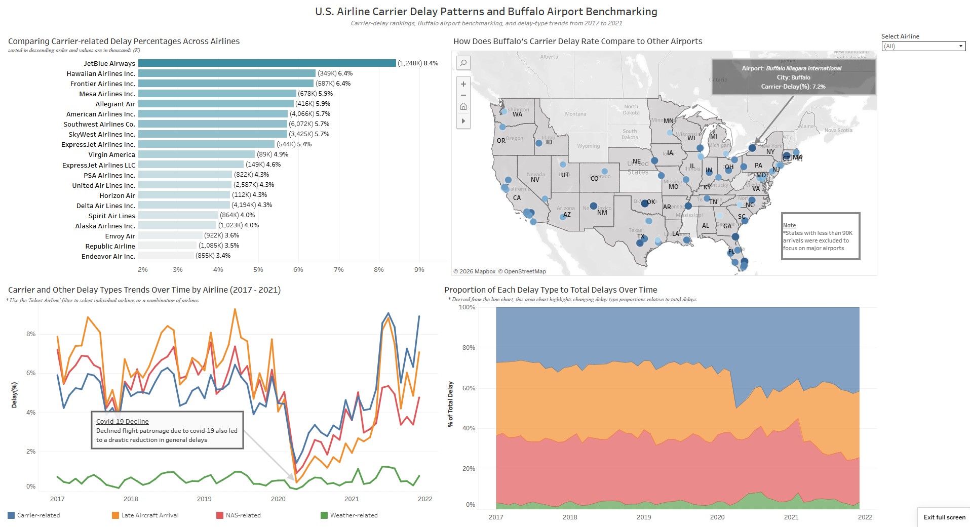
Airline Delay Analytics Dashboard
Analyzes airline carrier-delay percentages, compares Buffalo Niagara International Airport against other airports, and tracks delay-type patterns over time.
Carrier-delay rate comparison
Buffalo airport map analysis
Delay trend and proportion analysis
Open interactive dashboard →
Workforce Analytics
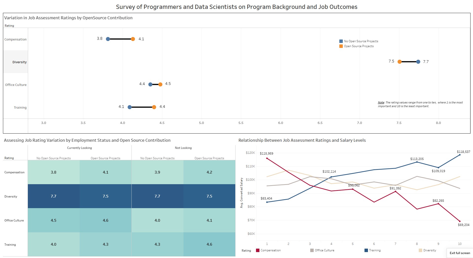
Stack Overflow Career Priorities Dashboard
Explores how programmers and data scientists rate job factors such as compensation, training, diversity, and office culture across open-source participation and salary levels.
Dumbbell comparison chart
Employment-status heatmap
Salary relationship analysis
Open interactive dashboard →
Location Intelligence
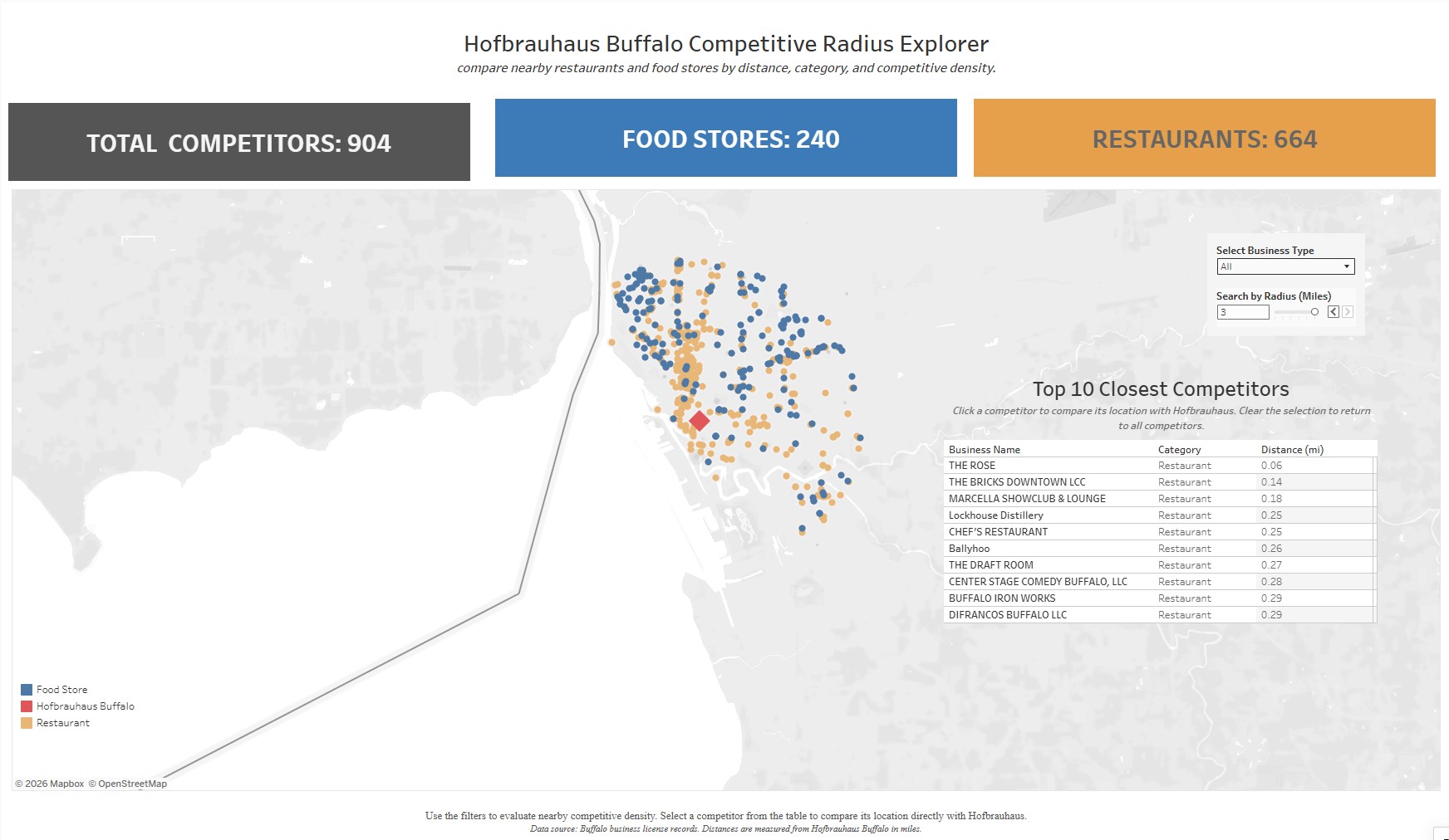
Hofbrauhaus Competitive Radius Dashboard
Explores Buffalo business-license data around Hofbrauhaus to identify nearby competitors by distance and category. Users can adjust the search radius, switch between restaurant and food-store views, and compare competitor counts dynamically.
Radius-based competitor filtering
Restaurant vs. food-store comparison
Dynamic KPI counts
Open interactive dashboard →
Dashboard Development Process
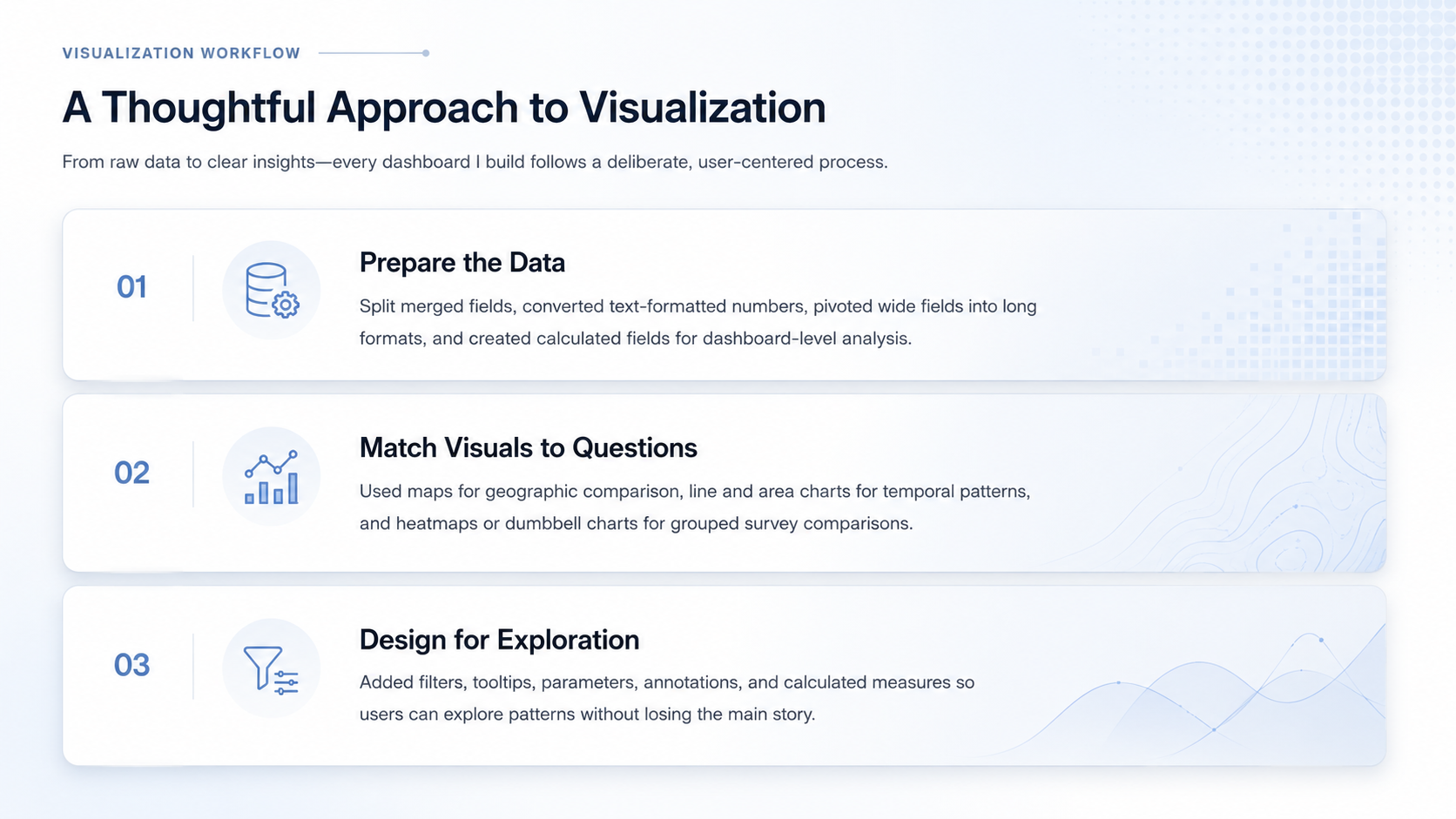
Across the Tableau and Power BI projects, the workflow moved from data preparation and transformation to visual encoding, dashboard interactivity, and final insight communication. The goal was to make each dashboard answer a focused analytical question while remaining clear enough for exploratory use.
Skills Demonstrated
BI Dashboard Design
Built Tableau and Power BI dashboard layouts with chart coordination, visual hierarchy, labels, annotations, and interactive controls.
Calculated Fields & Measures
Created analytical metrics such as carrier-delay percentage, business category logic, radius filters, grouped survey-rating fields, and BI measures for reporting.
Data Transformation
Used pivots, field splitting, joins, grouping, filtering, and reshaping to prepare datasets for Tableau and Power BI analysis.
Visual Storytelling
Connected dashboard design choices to business, workforce, and operations questions using readable visual encodings.
Artifacts
Active Tableau dashboards are available through Tableau Public. Power BI public report links are included as inactive placeholders until publishable versions are available.
Tableau Public Profile
Public profile containing the published Tableau dashboards.
Open Tableau Public →Power BI Public Report Link
Placeholder for a future public Power BI report or portfolio-accessible dashboard link.
Power BI link coming soonDashboard Preview Assets
Static preview images used on this portfolio page to keep the experience fast, clean, and easy to scan.
Preview assets includedFuture BI Updates
Additional Tableau and Power BI dashboard cards will be activated when revised or public versions are ready.
Placeholders included